

Hugging a cactus is a good analogy to describe the first assignment of the newly created Design Systems team at Blip.
It’s not that we dislike cactus, on the contrary. Some of our team members’ video call backgrounds are memorable for the sheer number of this spiky flora on display. Some even say, one of them have sprouted inspiration for big project codenames within the company.
However, no matter how much we indulge in cactus appreciation - just look at its strong stem, its various arms, flowers and even the patterns from the spines – our little remaining self-preservation instincts ensue we don’t want to touch them, let alone hug them. In the end we did more than embrace a cactus. Like the desert camel, we ate it whole. “How on earth do camels eat a cactus?” - you ask. Let’s see what National Geographic has to say about the matter:
“…The camel's rotating chew distributes pressure from the cactus and the papillae slide the needles vertically down the throat. This way, the sharp ends don't poke the camel as it ingests them…”
Oddly enough, this is somehow a good analogy to how the first big assignment of Blip’s Design System team was handled from the start. It will make sense further down this article, we promise.
What is a Design System?
Here’s a couple of good and simple explanations of what a Design System is, from industry experts Brad Frost and Nielsen Norman.
- "A design system as the official story of how your organisation designs and builds digital products." - Brad Frost
- "A design system is a living, complete set of standards intended to manage design at scale using reusable components and patterns." - NN Group
The root of our cactus
Let’s start at the root level. Why are we writing this? Imagine you work for a digital product company (if you’re reading this, you probably do already) and you’re faced with a dilemma: You are a designer or developer working for a brand with an ageing product. Through each ticket, you realize it’s getting harder and harder to design or implement new features and designs. Your works keeps getting red taped because “legacy code” or “hard-coded” reasons. Customers keep complaining about app performance and you feel the product is hitting a technical ceiling. You keep hearing about the need to rebuild or refactor, but there’s never the budget or time, and the risk-averse business nature might fear losing customers, traditionally averse to change.
What does this mean?
Legacy code: Code written by others or under a previous language, architecture, methodology, or framework that pertains to the current project. Yet still in use. Legacy code might be hard to rewrite because of integrations.
Hard-coded: Hardcoding is writing code that is not easily modified or reused. A hard coded information cannot be easily changed without changing the source code of the program itself.
Imagine the brand you work for was just acquired by a larger umbrella group, Flutter. Sudently some of your competitors are now part of your family. Within this family, you notice your newly met sister brand has recently undergone your pain, and they came out on the other side with a brand new, state of the art tech stack, full customizable and dynamic content management, faster, sleeker, more efficient.
You’re faced with two options: go through the same epic, or borrow the technology, save time, effort and money. Seems like a no brainer, but as in life, there are always good and bad implications on every decision we make. We’ve asked our designers to lay down some pros and cons of this approach, using the true and tested SWOT analysis.
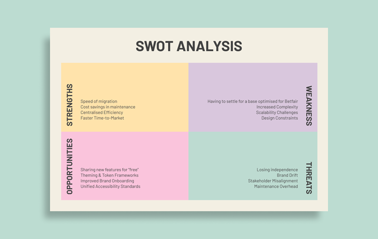
What’s a SWOT analysis?
SWOT stands for Strengths, Weaknesses, Opportunities, and Threats, and so a SWOT analysis is a technique for assessing these four aspects of your idea, project or business.
Eventually, the path chosen by your product directors was to adopt the technology from the new sister brand. It’s important to understand that this approach, although seemingly logical, won’t apply to every industry. The betting digital products industry is a pretty standardized affair, because each move away from the status quo must be met with confidence in terms of user experience.
This is because it’s very common for a single user to have many different competitor apps installed at the same time, browsing for the best price on a specific match or race. There’s always room for different approaches, but it will probably never be an AirBnB/Booking situation, where the products do similar things but with distinct user journey experiences. Betting is closer to Uber/Bolt levels of similarity, where prices are often more important than the experience or customer support.
Cactus spike - No previous culture of working with Design Systems
One challenge we faced collectively as an organization was the previous lack of culture in working with a Design Systems team. Every new process takes time to be advocated and engrained in the day-to-day routines. Humans are creatures of habit after all.
You might asking yourself: If the technological foundations for all brands become the same, the user experience is expected to be similar and the market is the same, what’s different between betting products then? In an industry where for better or worse, standardization and resource sharing is becoming a common practice, the differentiation will rely increasingly on value, best prices, loyalty programs and marketing tone of voice.
This is not a new concept. It’s been happening for decades in the automotive industry for instance. Take a VW Golf, an Audi A3, a Skoda Octavia, or a Seat Leon. These are all very popular automobiles in Europe, and, believe it or not, they all are the same exact car underneath. So, like in Flutter group, the platforms and the technology are becoming the same to benefit from cost synergies. However, each brand still must cater for a different demographic, regional focus, and “trim levels” if we want to keep the automobile analogy.
Bringing one more brand into this fold of shared design and technology stack is just the first trial. Our ultimate goal is to grow this Design System to serve all the brands within the huge betting conglomerate that is Flutter.
What is a House of Brands and a Branded House?
- A House of Brands is home to numerous brands, each independent of one another, and each with its own audience, marketing, look and feel. Ex: Meta (Facebook, Instagram, Whatsapp).
- A Branded House maintains the focus on a single, well-known and consistent brand across all its products. Ex: Google (Gmail, Google Maps, Google Chrome).
A Siamese Cactus
Let’s start going up through the stem. We are yet to work on a project that follows the initial vision to the letter. At this point we believe such undertaking only exists in our idealistic minds. Designing digital products that exist in reality outside our shiny Figma canvas, is more often about knowing how to navigate and negotiate compromises within your circle of stakeholders (developers, product managers, other designers…), than it is to know where to push the pixels.
We can say that the Betting industry is usually split into two main product offerings: Sports Betting and Online Casinos. Although most brands will operate on both sides, usually each one will have its own digital app or web environment. Code and design may or may not be shared or the product decisions might follow a different stream. The thing is, when working with digital product, usually nothing is created from scratch. There’s always some inheritance we have to deal with, whether it’s legacy code, third party integrations or simply a matter of circumstances.
Cactus spike - Everything, everywhere all at once.
The herculean task of migrating the design and tech stack from SkyBet to Betfair was given just an 18 months' timeframe for completion. Design, stakeholders and tech teams that barely knew each other now were suddenly mixed in an high stakes environment. Compounding the pressure with lack of Design System culture, the ever-present project scope tweaks made this a challenging project to coordinate.
When the decision to adopt SkyBet into the Betfair tech and design stack was made, Flutter UKI had two main libraries to choose from. “The Wall” powered Betfair, while “Abacus” powered the Paddy Power brand. Although The Wall eventually was chosen due to the state-of-the-art dynamic content management system on the Sports Betting side, the truth is that Abacus was more mature in its adoption on the Online Casino sub-product.
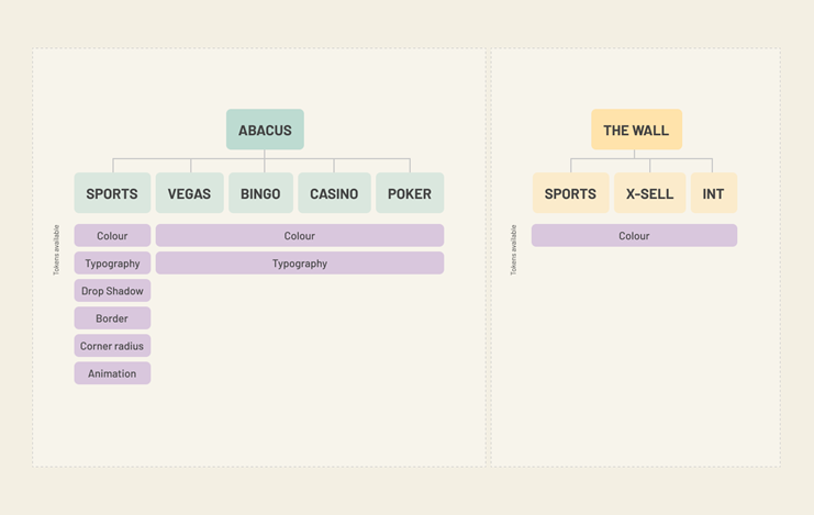
You can probably see where this is going. From the vision of creating a single unified Design System to hold multiple brands, we immediately had to compromise for a less-than-ideal siamese scenario of maintaining two parallel systems. There’s a quote from Lucas Vallim, Lead Product Designer at Revolut (at the time of writing) that might resonate with this situation:
"Modern tech culture is all about the low-hanging fruits, the fast wins, the MVPs, and the most optimized user flow. And that’s all fine. But once you’re in MVP mode, you'll never really get out of it."
This doesn’t mean we won’t ever unify the systems in the future. We just want to show that a plan and a execution of a plan will always have divergences. Also, as we had the opportunity to learn from chatting with Louis Ouriach and his folks from Figma, sometimes two systems are better than one.
Cactus spike - Four years of technical debt
"The Wall”, although state of the art, wasn’t built without its struggles. In a company without a previous culture of working with a Design System, there was a multi-year gap created between Design and Tech teams. From naming to component architecture, to tokens. The misalignment between teams was obvious and well known. A four year gap that had to be narrowed while onboarding the SkyBet brand. Because we like analogies: It’s like fixing a train while it keeps moving full steam ahead. 1001 cars long.
Two Arms, for Now: Design Systems Grow — So Do Teams
A Cactus can have many arms. More arms mean more water and nutrients needed to keep it healthy. Although sharing code and design might reduce the amount of manual pixel pushing, there is still a maintainer-to-product ratio you have to follow to make sure the system keeps manageable. Greater control means greater accountability. From two designers working each on the The Wall and Abacus before SkyBet came into the fold, we had to grow our team to nine designers and a full development team. Does 15 Design System maintainers seem a lot of people to oversee a population of six million users?
Cactus spike – Evolving from a Product Designer to a Multi-Brand Designer
In the past, when asked to design a new feature, designers knew what brand it was for. They knew which color palette to use. The scope was narrow and specific. However, moving to a multi-brand environment will require every design to be made agnostically, as it will have the potential to be re-used across every brand in the group.
One particular strenght of the cactus is that if the stem is solid, you can grow lots of arms from it. Same with a Design System. If you build strong shared foundation (or roots), you’ll be able to add new brands on top much more easily.
Some common and well documented Design System foundations are:
- UI Kit (Design) with flexible and agnostic components: Unfortunately, when most people picture a Design System, the first thing they think of is the UI Kit. A User-Interface kit is usually a Design File (made within Figma, Sketch, Framer…) that stores non-coded, visual reference components consumed and interacted by Designers. It’s important to notice that the users won’t ever interact with these components in the live product. They are visual representations of what the code should look like, but not a working component by itself.
- Working components library (Code): This is the equivalent of the aforementioned UI Kit, but for developers. It usually contains snippet of code ready to be copied and implemented in a codebase.
- Guidelines: Guidelines can be synonymous with documentation or instructions on how to use a component. It can also be the brand palettes of not only just colors, but corner-radius, shadow styles, spacings, typography, borders, sizing, opacities etc. In a multi-brand environment, designers might be asked to work on different brands one after the other, or even at the same time. This will help designers navigate each brand's intricacies.
- A Design Tokens repository: A design token is a design decision written in code. It’s a universal language that every coding language should be able to understand. For a company as large as Flutter, the design tokens are probably the most important creative artifact in our assets. It’s the single document (or multiple if you want) that holds every decision, every color, every theme, every mode, every semantic rule ever created by designers and developers. Design tools come and go, each new one requiring a costly and time-consuming migration of designs. Tokens make us think of ownership. Who stores your Design? Is it your company, or is it your tool? We like to think that if you have your .json file (hopefully in a shared repository) , with all the Design tokens, Figma or any design tool you use could cease to exist tomorrow, and nothing would be lost.
- A governance rule book: Governance is a set of rules that will explain how all the moving parts communicate between each other. All the teams, the stakeholders, the tools, the systems. Even with the best tools and guidelines, without governance, everyone will work in anarchy.
- A reference hub (whether a website or internal tool): This is supposed to be the shop everyone goes to fill their needs. Whether it’s a component, update on a process, or latest decisions around any product matter.
Design Tokens: Flowers That Keep Your System Blooming
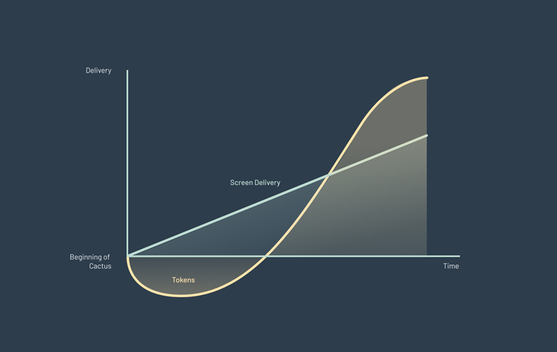
A Design System story like this wouldn’t be complete if we didn’t mention today’s hot topic in the Design community: Design Tokens. For us in the Flutter UKI Design System team, the single main artifact we’d run away with if our house was on fire, would be the tokens repository. They are the single source of truth. The locker of all decisions. They are the neural terminals that connect Design to every bit of visual code you can see on the product.
From Developer Tool to Design System Essential
Design tokens have been around for a while now. We can trace their origins back to 2014, when they were first experimented with by Jina Anne and her team at Salesforce. However, until recently they’ve been just a tool used by developers to create constant variables, instead of having to manually input numeric values and hex codes all the time while coding. In recent years, with the help of tools like the Tokens Studio plugin or Figma Variables, the concept of a design token is becoming mainstream, regardless of format.
A Real-World Breakthrough: The Light Mode Challenge
We believe there is a proportionality between the size and complexity of one company and the need to adopt Design Tokens. At Flutter, one of the first true breakthroughs with Design Tokens was in 2022, when Betfair Sportsbook, powered by The Wall decided they wanted to provide the capability to their users to switch the color scheme to a light theme (kind of counterclockwise since most of the industry went from light to dark modes).
The timeline was not friendly. The team would have just about 3 months to go from “what is a token?” to a customer firing up the app and saying, “oh look, Betfair has a light mode now!” The two options on the table were the same as always: either duplicate every single screen, component, environment you’ve ever done and recreate it with light colors, and live with an infinite maintenance overhead forever, or learn to extract all the potential design tokens have to offer. We thankfully followed the latter.
No One-Size-Fits-All
It’s important to keep in mind that each organization needs might require a different token approach. Although the W3C (World wide web consortium) is working on defining universal standards for Design Tokens, the open nature of tokens will always be able to adapt to different contexts and needs. Tokens are usually separated into three main purposes: Core, Semantic and Component Tokens.
What is a Design Token?
While there are more specific answers to this question, generally all industry thinkers will tend to agree that a Design Token is a small, reusable design decisiona that make up a design system's visual style. Although technically you can name a token whatever you want, it’s common to see them occupying one of three conceptual levels:
Core Token: A Core/Base token is a raw value. Ex: The colour hex #FFB80C is converted into the core token “yellow”, or “yellow-10” if part of a color scale.
Semantic Token: The semantic token will give meaning to a core token. Ex: “yellow” core token is linked to “primary color” semantic token.
Component Token: Component tokens are usually optional, but are useful to allow that extra mile of freedom to design, as every component will gain independence (when needed) from the semantic tokens. Ex: “primary color” semantic token is linked to “primary button background color”.
At Flutter, being a huge conglomerate of brands and products working in many different markets, it made sense for our team having a full 3-layer token system. Doesn’t mean your team will have the same needs.
Did you know?
In Australian, cactus is used as slang meaning "dead, useless, or broken."
Our Australian friends at Sportsbet must have had a laugh when they were told their siblings at Flutter UKI were working on project broken.
How to Take Care of Your Cactus
Buying your cactus and bringing it home is where the true responsibilities start. If you let it as it is without care, water and nutrients, it will probably not develop much, or worse, it will die. Same goes for design systems. Creating one button might be the birth of a Design System. It’s as simple as that. The challenge, harder than feeding a cactus, is teaching our organization that re-using our button has benefits. Advocating, teaching, and evangelizing. This is the hardest part we’re facing with deploying a Design System.
1. Looking at a Design System as a long-term investment
Once Albert Einstein said that the 8th marvel of the world was a financial concept we know as compound interest: Having money grow exponentially and automatically over time, with minimal input from the funds owner.
We believe Design Systems also follow a logic of compounding profits, or if you do it wrong, compounding (technical) debt.
One advertising point usually shared by advocates is that the Design System speeds up the design and development roll out. It doesn't. Not at least linearly and instantly. Like compound interest, you must let all the small decisions and design solutions compound over time, and automatically they’ll start taking effect and avoid issues without requiring intensive manual input all the time. It’s very hard to convince project managers to give away small instant gains for a larger benefit somewhere in the future. So like compound interest, Design System has to be dealt with like a long-term investment.
2. Be aware of timings
Here’s a thought that perfectly pictures what our Design System at Flutter went through in the recent past:
“There are periods in your career when no matter what you say, people just won’t 'get' systems. (…) There will be other times where you’ll have incredible advocates who not only 'get' systems but invest in you and your team." - Dan Mall.
Prior to SkyBet adopting The Wall design system, the Betfair team tried to implement a design system for at least four years. Big project plannings were drafted, presentations were put together and relevant stakeholders consulted. One thing was missing though: a specific and time-sensitive business reason to invest. Suddenly, when SkyBet needed to be onboarded into The Wall tech and design repositories, it became perfectly reasonable to ring-fence 15 people (designers and developers) into an official Design System team. No matter hour hard we pushed before, nothing ever happened, not because our communication was ineffective, but for sheer bad timing.
3. Sticking to the plan
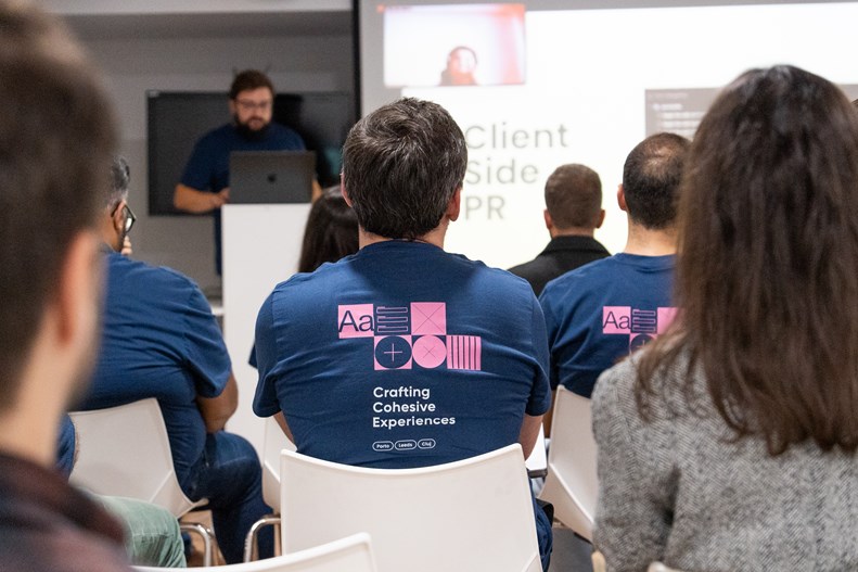
One thing we’re learning is that no matter how many clever process diagrams, guideline sheets, videoconferences around tips and tricks etc. All of this won’t penetrate the audience without persistence and consistent messaging. Persistence is essential if habits need to be worked. We’ve been trying to get closer to designers through several ways: creating open channels for communication between teams, empowering designers with the ability to report bugs or missing features directly to a JIRA backlog. Ring-fencing a Design System designer and developer to focus full time on supporting designers and fixing bugs. However, probably the most ambitious initiative we’ve undertaken was the hosting of our own internal conference, codenamed CCE (Creating Cohesive Experiences). A big challenge of course, but and as popular knowledge says: the best way to learn is by teaching.
Conclusion
This article is not a guide, nor advice. It’s a gathering of insights and personal perspectives from the specific nature of the business we work in. As a team who focuses on Design Systems, we keep trying to converge our creative outputs into clear rules and patterns, conforming, reusing... But then Design is a naturally divergent creative area, so compromise is unavoidable. Humans are creatures of habit, so although it will sound cliché, if your Design System isn’t adopted by the people it’s trying to serve, it’s not a Design System, it’s a just a warehouse full of idle assets and promising ideas.
References and further reads:
- Product design is going down a weird path, but we can still save it - Lucas Vallim
- The State of UX, 2025 - Fabricio Teixeira, Caio Braga
- Why does everything look the same? - Isaac Fagerli

Joel Araújo, Marta Teixeira, Soraia Gonçalves


